Workday Mobile Worker Profile
-
As a Mobile Product Designer, I redefined the Workday Mobile app’s Worker Profile feature using an iterative process informed by research insights.
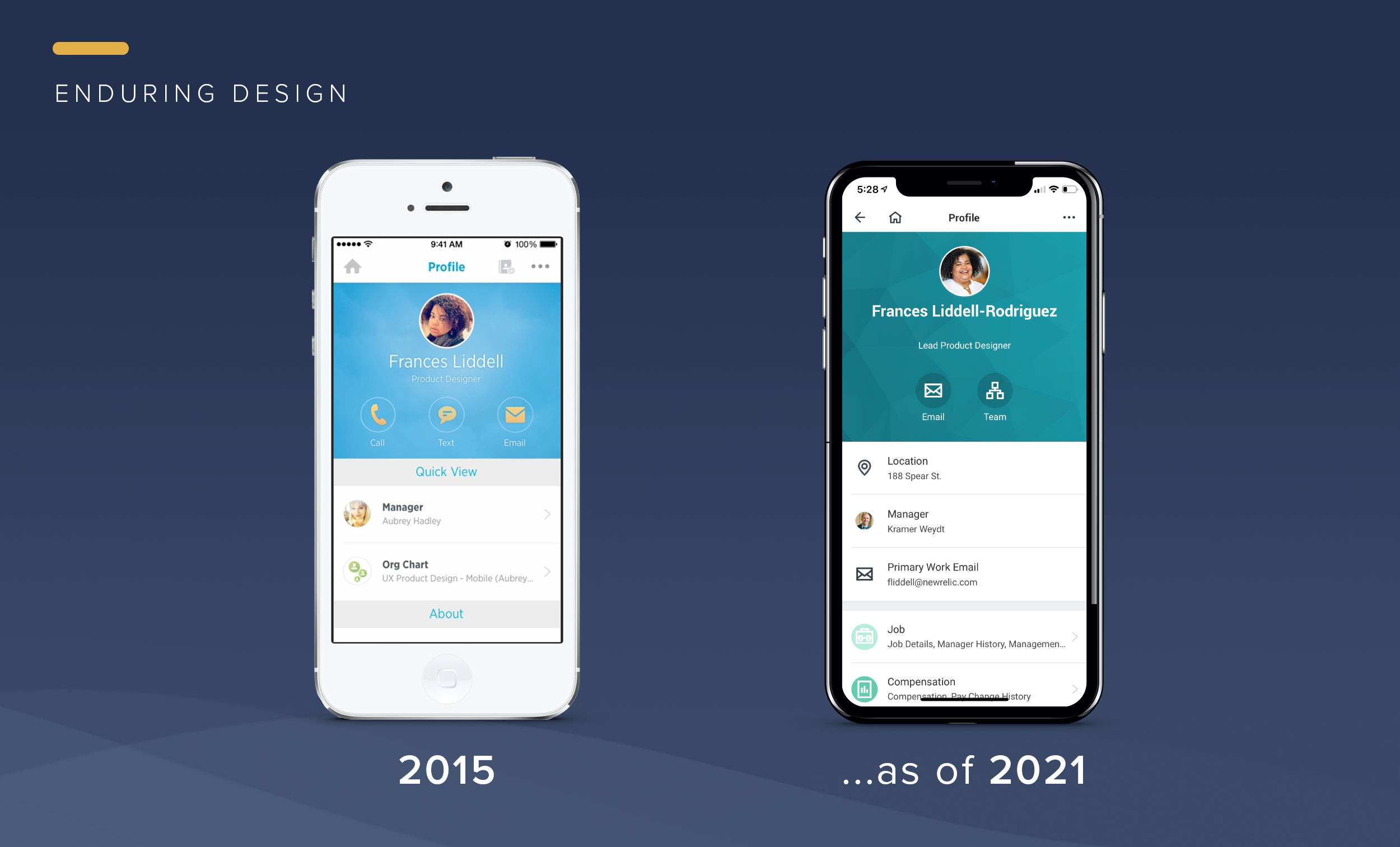
The resulting feature provides Workday Mobile users with a solid and strong user experience that has endured since its release.
My Role: UX Mobile Lead
Team: Product Manager, 5 EngineersUsers: Employees, Managers, Directors, Human Resource and Talent Acquisition Professionals
Activities Performed: User Testing • Workflow Diagrams • Wireframes • High Fidelity Prototypes • Iconography
Project Duration: 1 month
-
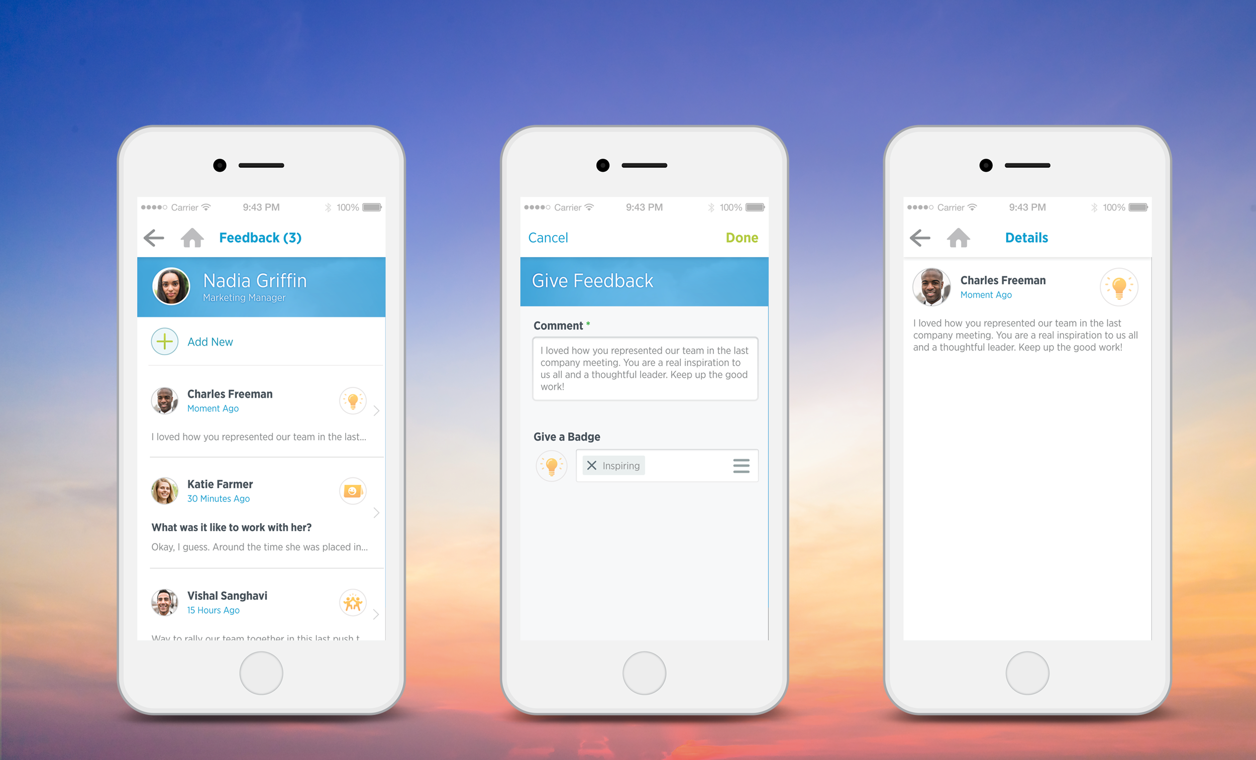
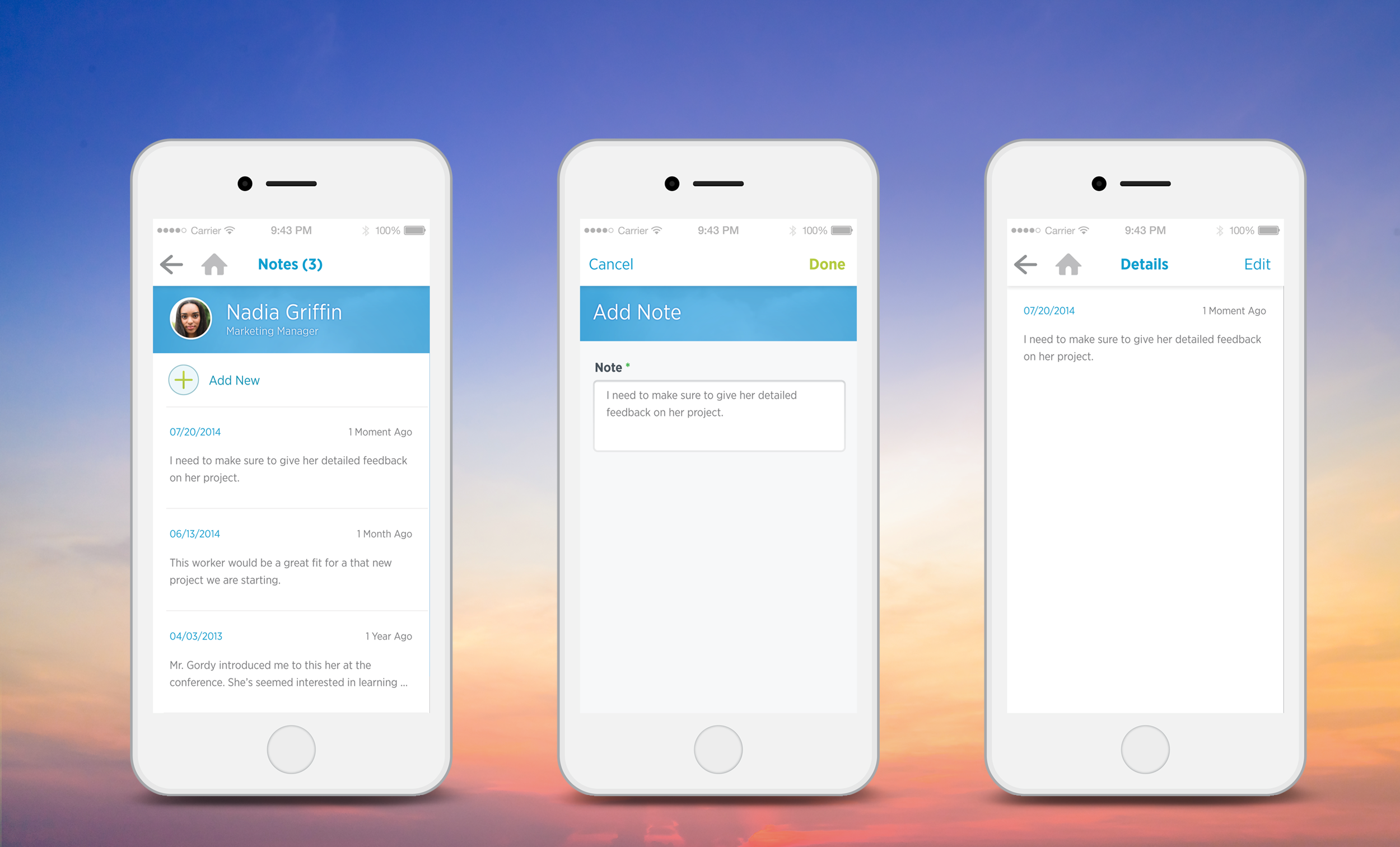
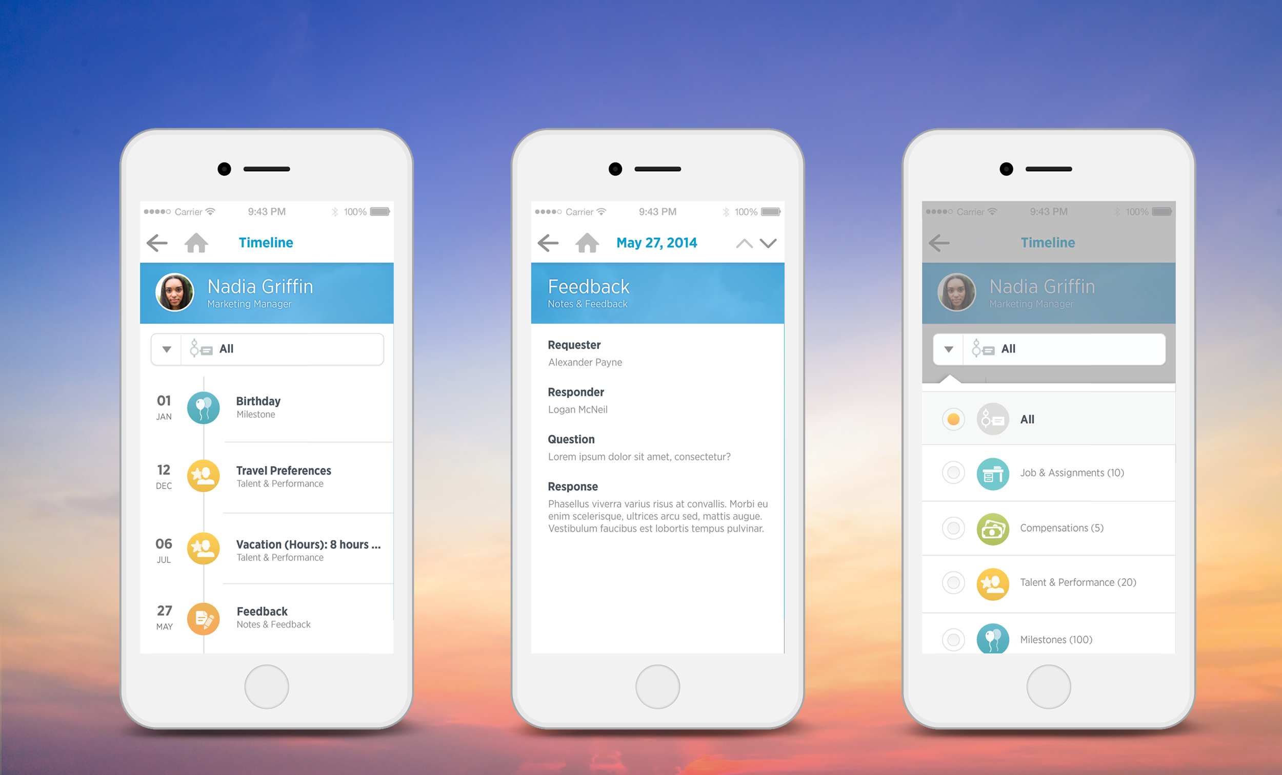
How do we improve the discoverability of profile details and reduce user fatigue?
Background: The Worker Profile is a professional dossier. Users get access to info about fellow employees and where they fit into a company.
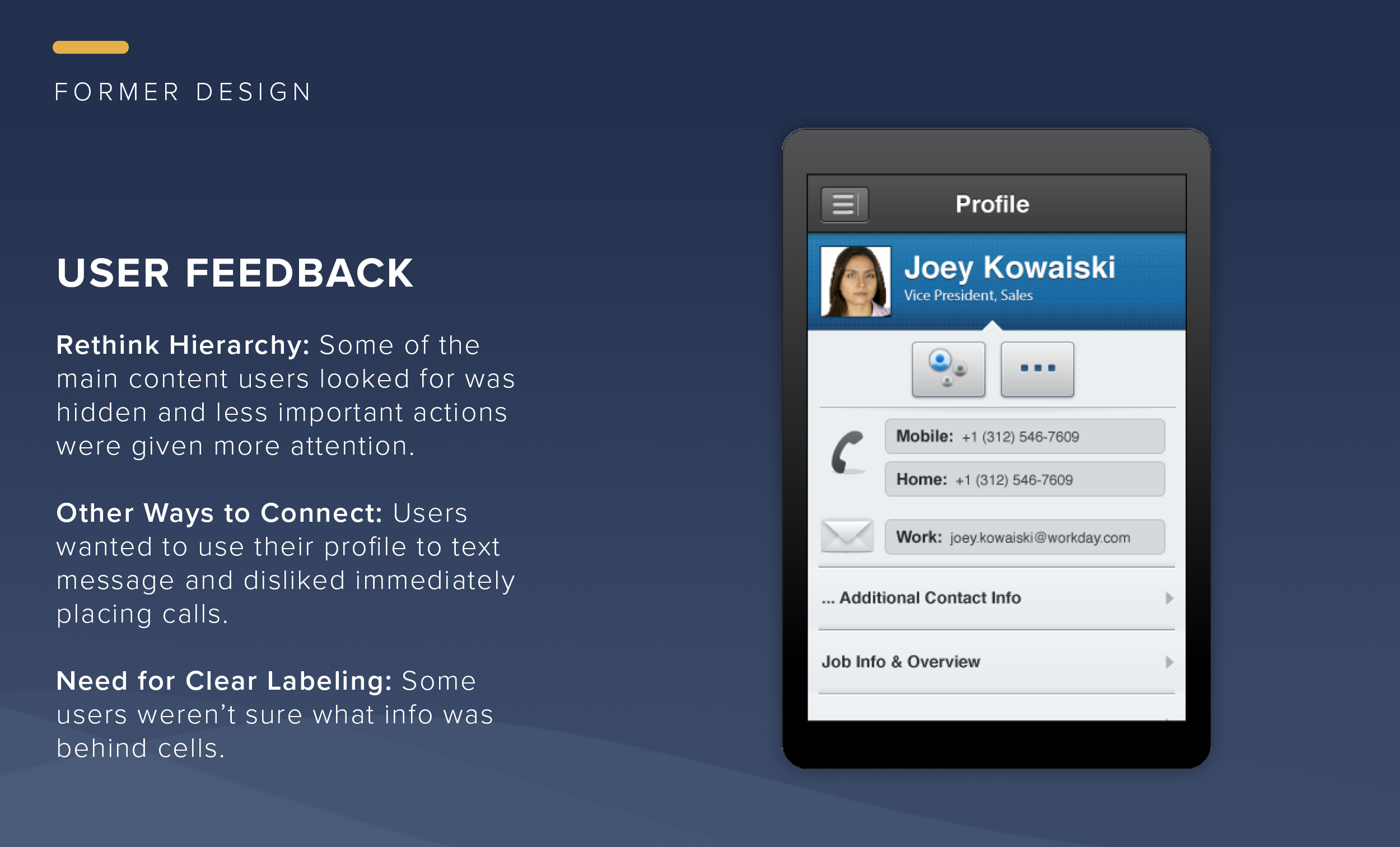
User Research Findings: Our user researchers tested the app with current and new customers, and even went out to street test our app with the general public. Three primary issues that were identified:
• Hierarchy - Most users came to this screen for coworker team info, to find a way to contact them but some of this info was hidden and wanted more content.
• Other Ways to Connect - Users wanted to be able to send a text from mobile rather than jumping immediately into a call.
• Clear Labeling - Users were some times confused about what info was behind the cells. Often spending lots of time clicking to find what they need.
-
Competitors & Industry Landscape: As we began our mobile redesign, we assessed our competitors—Oracle Peoplesoft, Success Factors and Ultipro. They just really weren’t evolving. Design was often inconsistent, cluttered versions of their desktop apps. Just because it’s a business process, it shouldn’t feel like work. And your users should not have to work very hard to do their tasks.
In addition to keeping an eye on our competitors we also observed what was happening in the world at large — the fall of skeumorphism and the rise of flat design, the birth of Google Material Design and iOS7, and explorations of new ways to navigate. Why look at the consumer space? Because we know that our users don’t live in our app like they live in Facebook, Twitter, etc. We approach enterprise app design by making interactions as familiar, easy to use and delightful as the consumer apps people interact with everyday. This benefits both the occasional user and the power user alike.
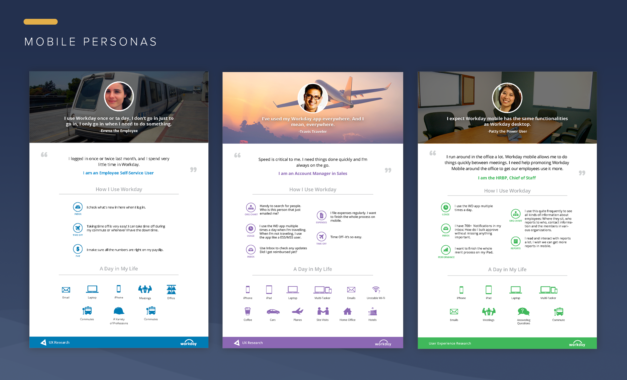
User Research (Mobile Personas): In the process of mobile redesign, our ux research team helped to expand our user personas. These personas would help us keep in mind who were were designing for and why.
• The Employee - A self-service user who only accesses the app to see if there are any new tasks, view payslips and request paid time off.
• The Traveler - A user who accesses the Workday often as while they are on the go. They are interested in learning more about the people they work with, check the inbox for new tasks and updates on reimbursements, to file business expenses and to request time off.
• The Power User - This user is very familiar with Workday and uses it all the time. They use the app to monitor team performance, create and view reports, filter and review notifications.
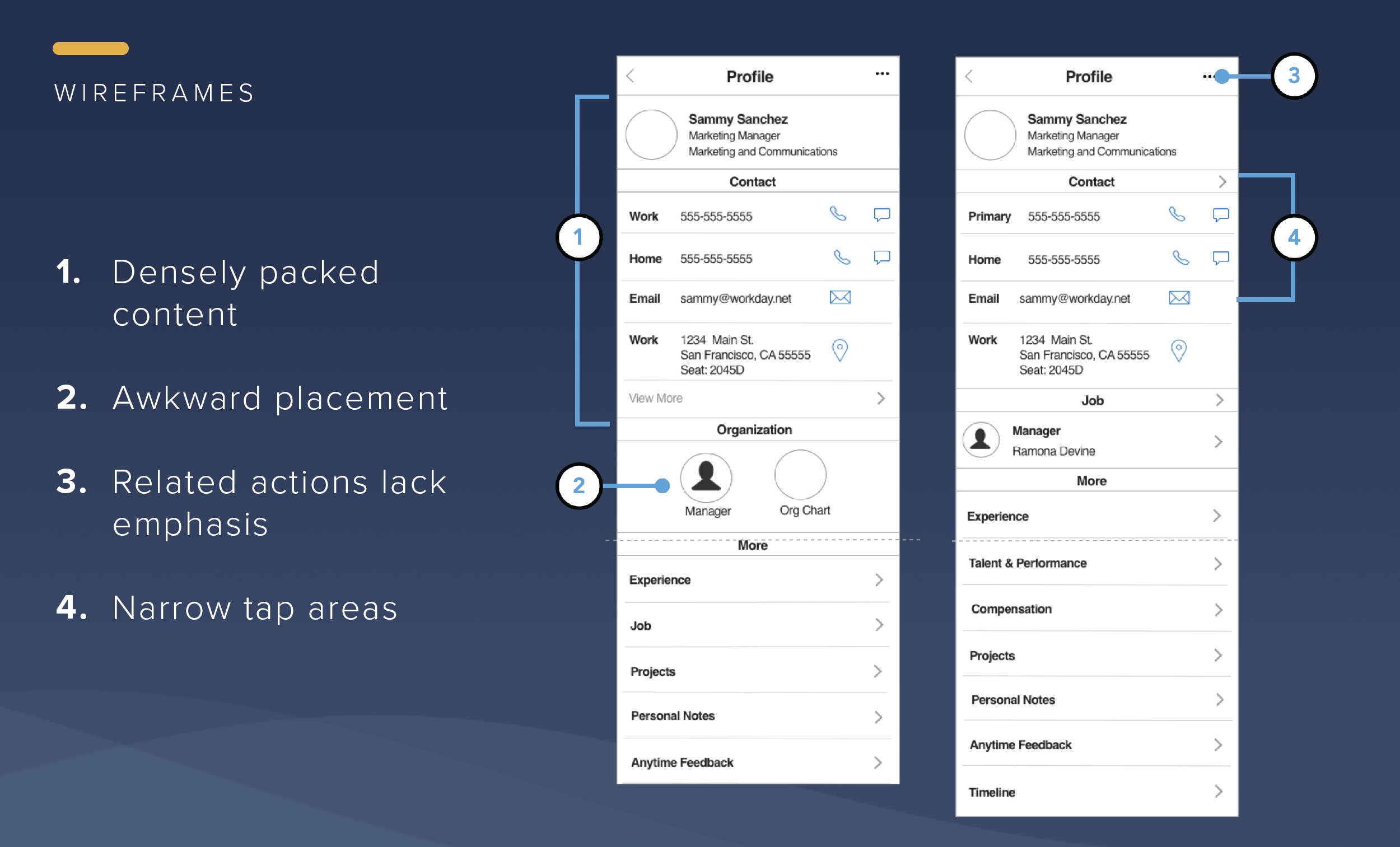
Iterations: While well organized, the first wireframes are an over-reaction to the need to see more content. Content overload resulted in a lot of tedious scrolling. The spacing given each cell was unrealistic. In reality, important information like organizational info would be hidden by the scroll and its awkward placement would interrupt screen scanning. We also found that users were not discovering Related Actions. There were too many narrow tap areas close to each other which would easily result in accidentally tapping the wrong area.
-
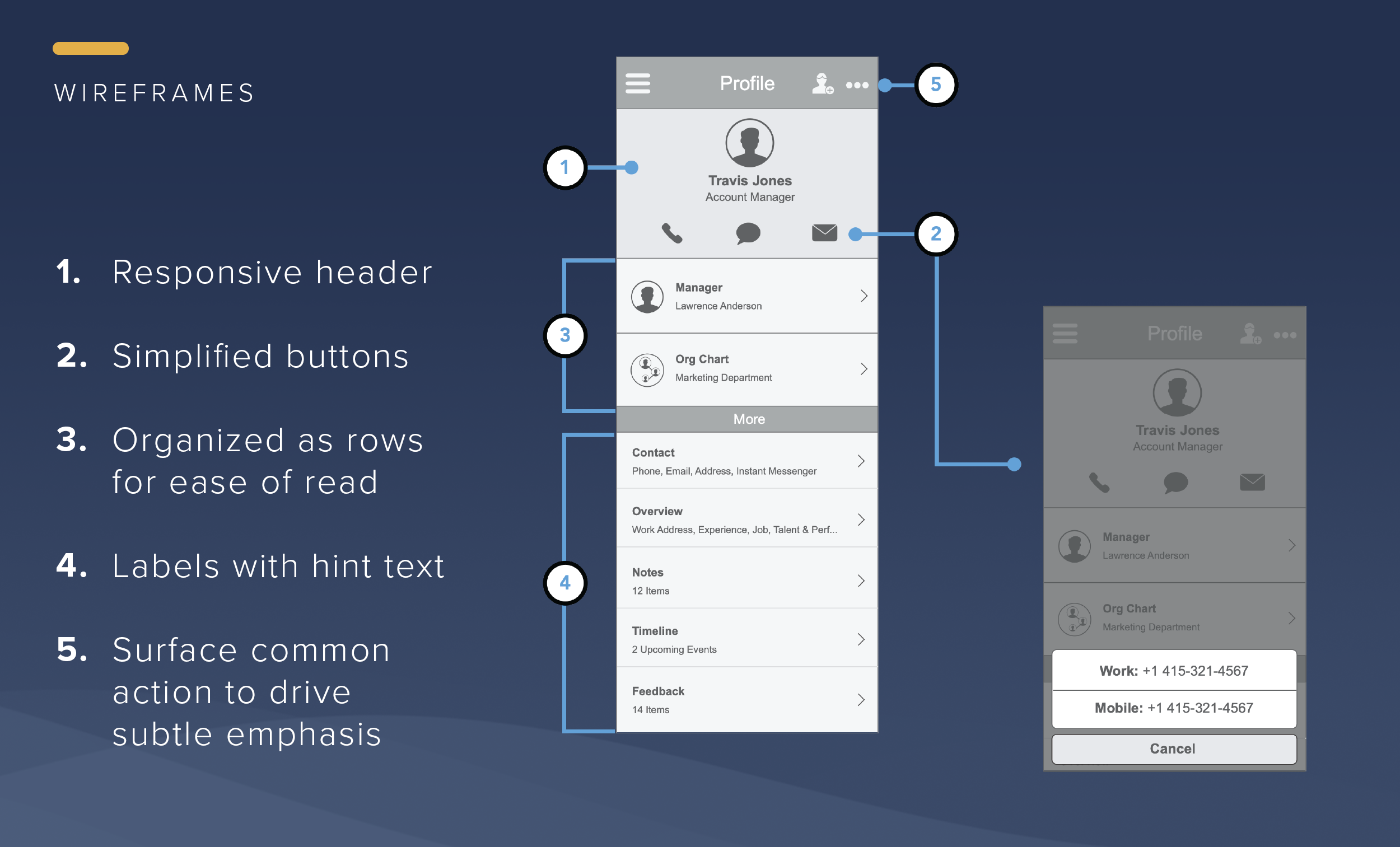
I presented a new wireframe that resolved issues of previous wireframes. I put all of the user’s functionality where it was easy to find. I broke up information into categories based on what I knew of the user research — Primary Info, Secondary Info and Tertiary Info. I created a clean header to create a focal point and more spacious layout so the user can clearly see info. The header is also responsive, giving context for the content. Contact info buttons were simplified to universally familiar icons with micro-interaction offering options for calling, texting and email. Organizational info was made easier to read and relocated above the fold. Labels with hint text give users more confidence in making their selections. I surfaced the most common action to familiarize users with our nav bar tools and draw them to explore the Related Actions menu.
I was also responsible for the visual design of the Worker Profile and several of the related screens (excluding Org Chart). I provided icons, created assets, applied font styles and delivered consistent specs. I worked closely with developers on animations, transitions and fine-tuning this feature.