New Relic Plans & Pricing
-
As a Lead/Staff Product Designer at New Relic, I was responsible for the research and redesign of the commerce user experience that helps buyers understand plan pricing, enables purchases and management of plans.
The project goal was to increase conversions of customers with annual spend below $25K.
My Role: UX Lead
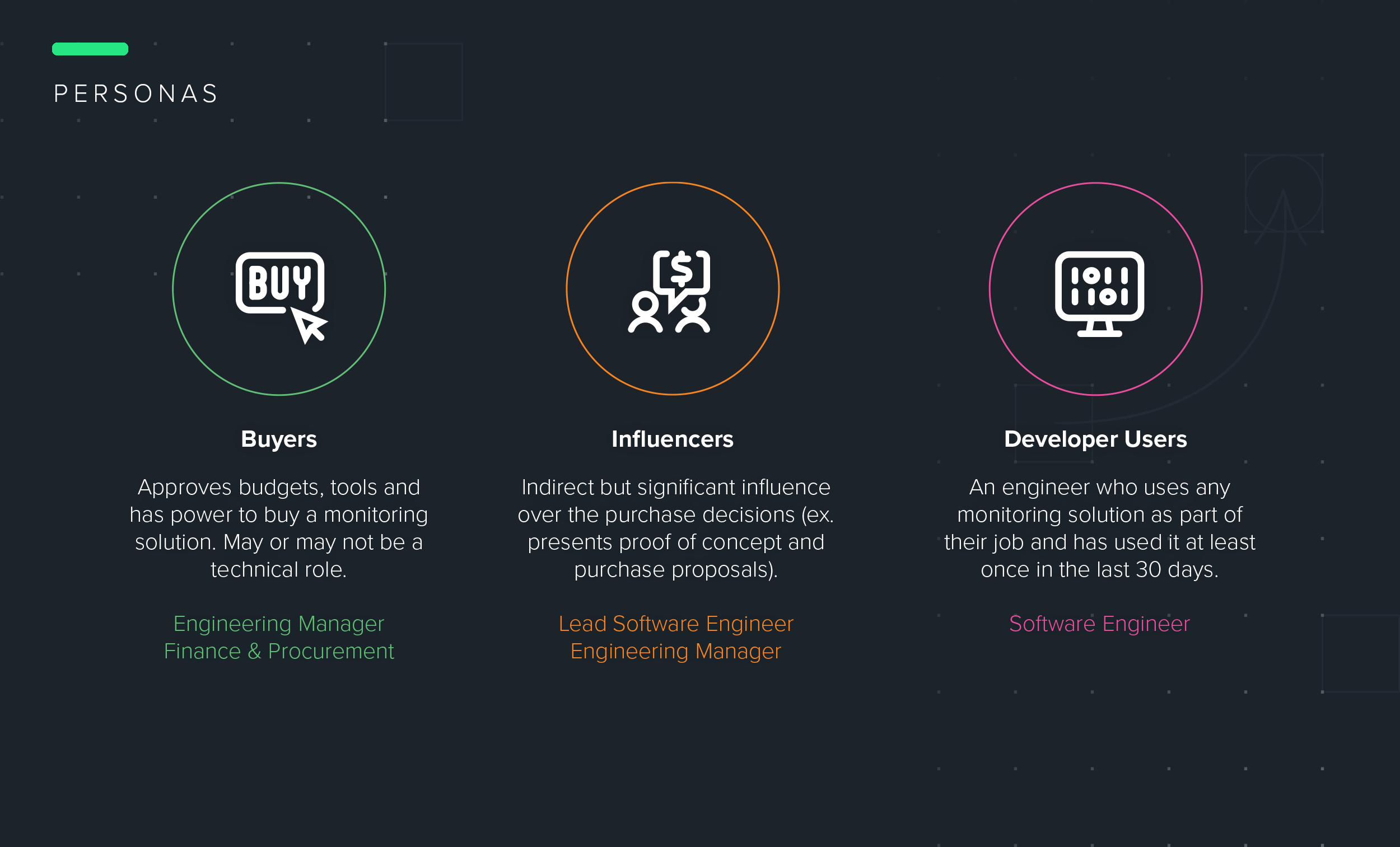
Team: Product Manager, Engineering Manager, 6 EngineersUsers: Engineering Managers, Software Engineers, Finance and Procurement Professionals
Activities Performed: UX Audit • Comparative Baseline Test • Workflows • Wireframes • High Fidelity Prototypes • Customer Calls • User Testing.
Project Duration: 7 months
-
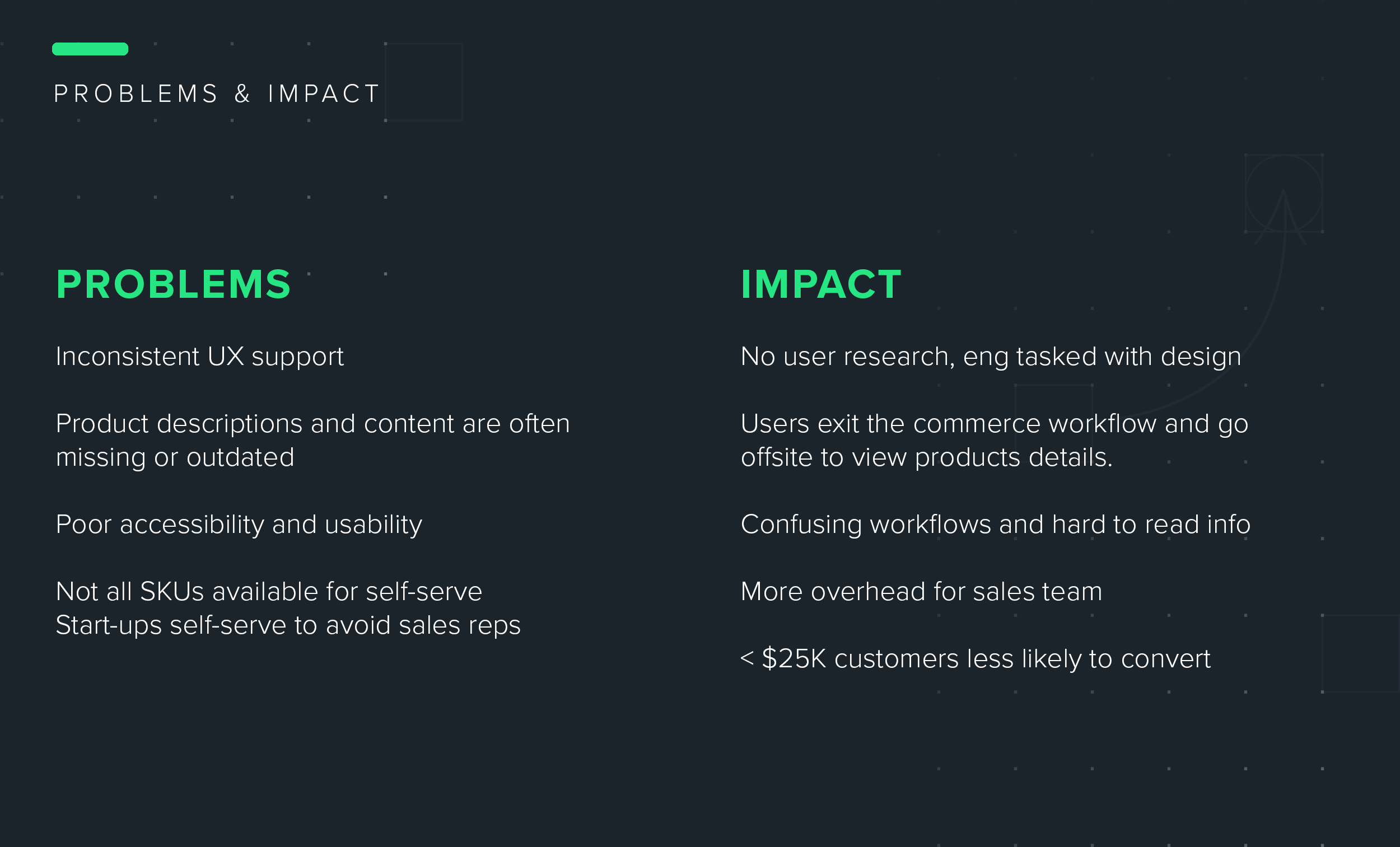
How do we increase conversions of customers with annual spend below $25K?
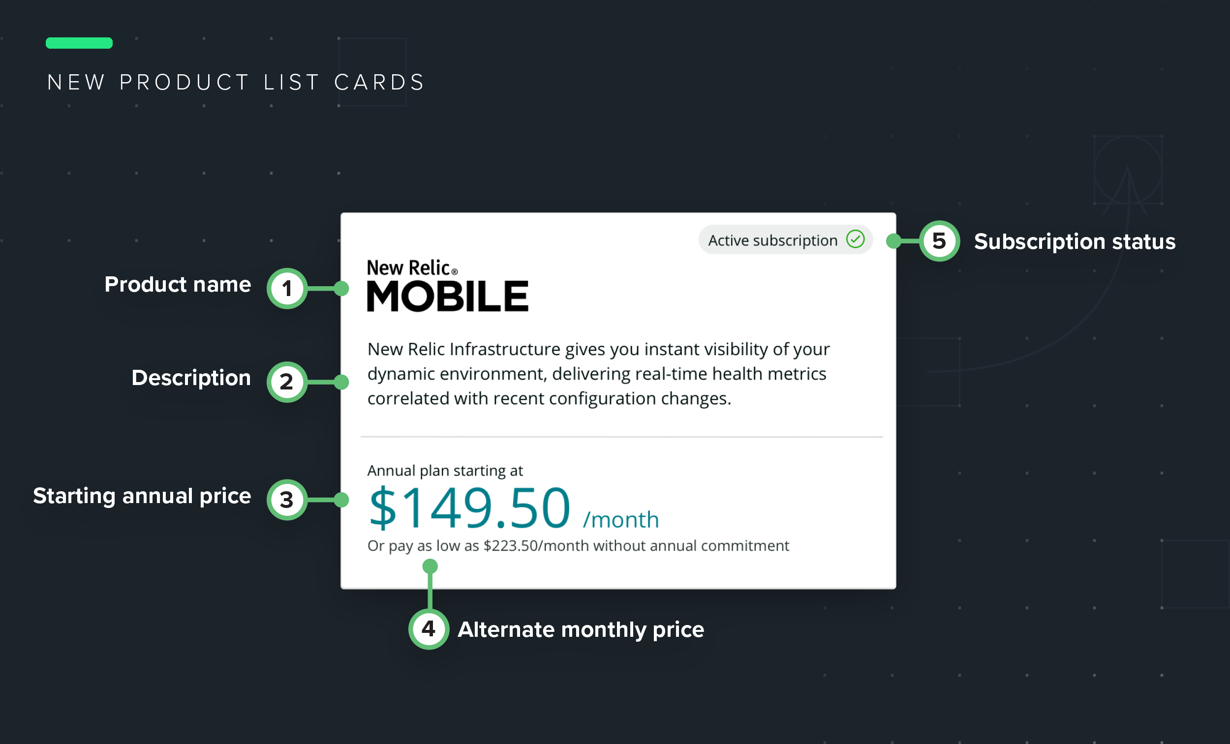
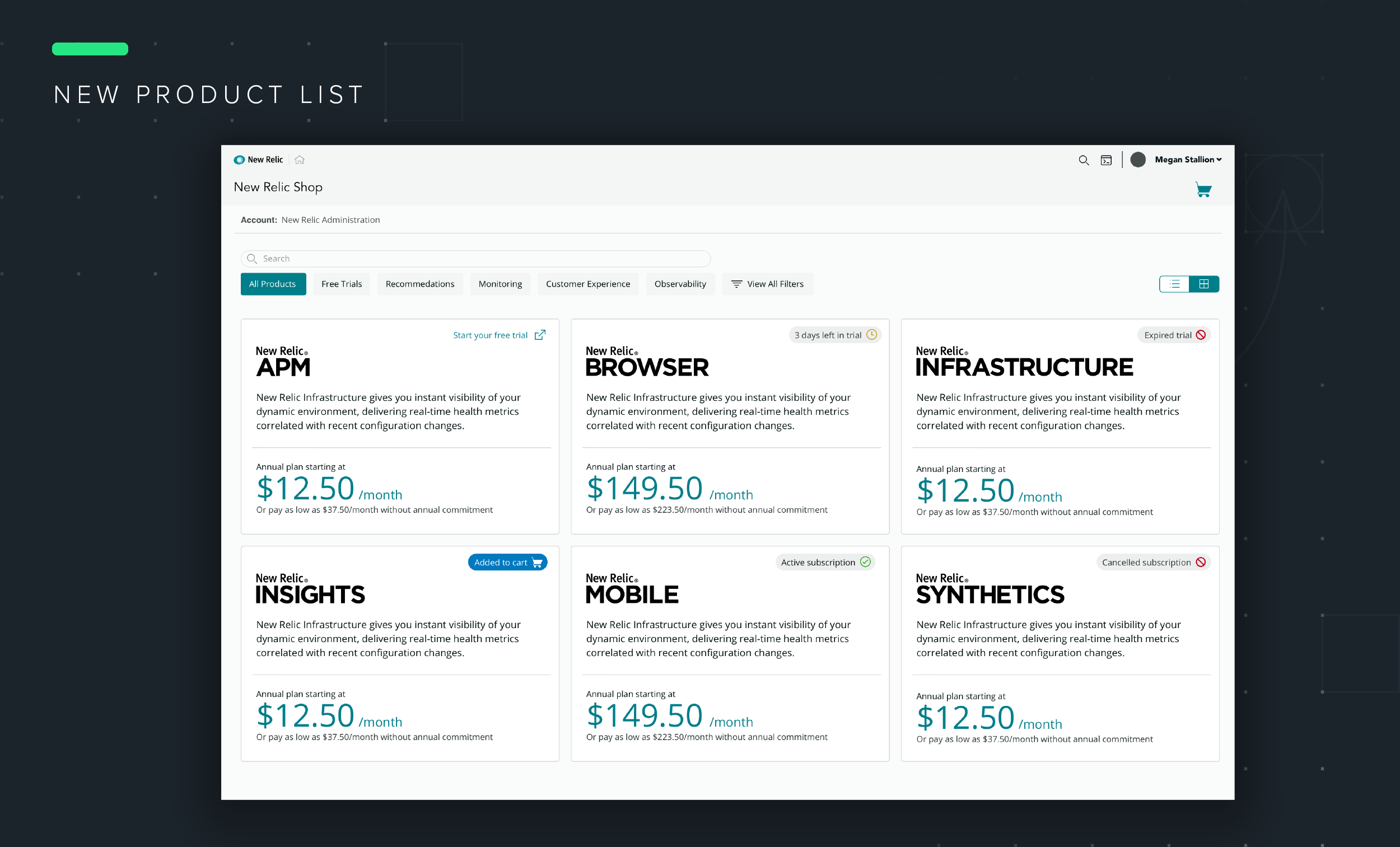
Customers overwhelmingly prefer to buy New Relic products online. However, many new SKUs were only available by calling sales. In addition, the storefront itself suffered low usability.
-
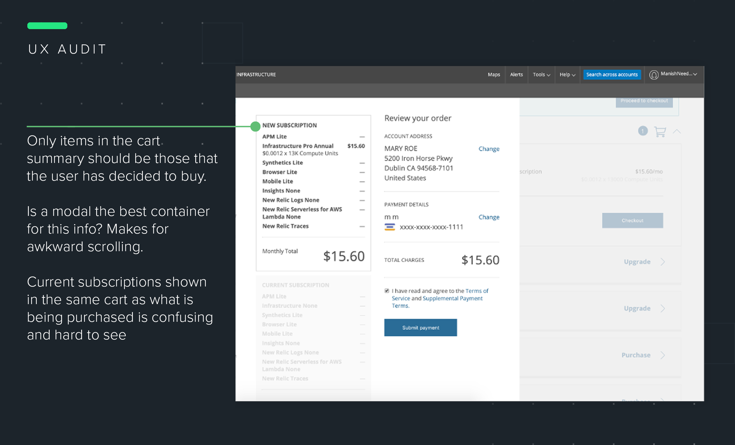
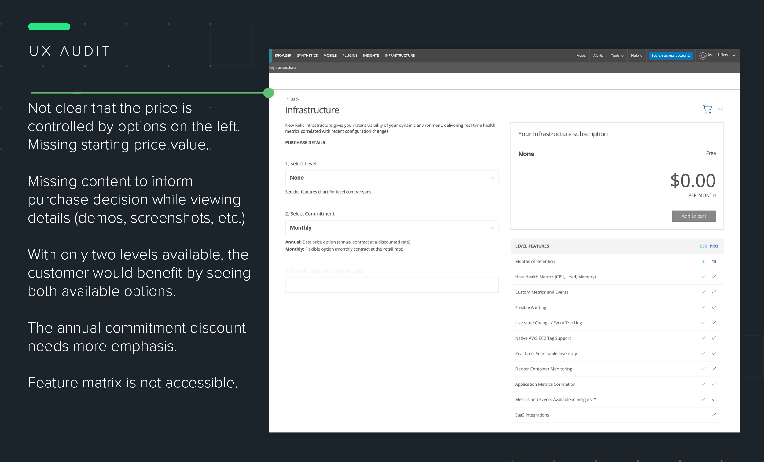
Comparative Baseline Study: I began by performing an audit of the current e-commerce experience. This audit helped to identify possible optimizations to wireframe and assumptions that could be validated through a comparative baseline testing.
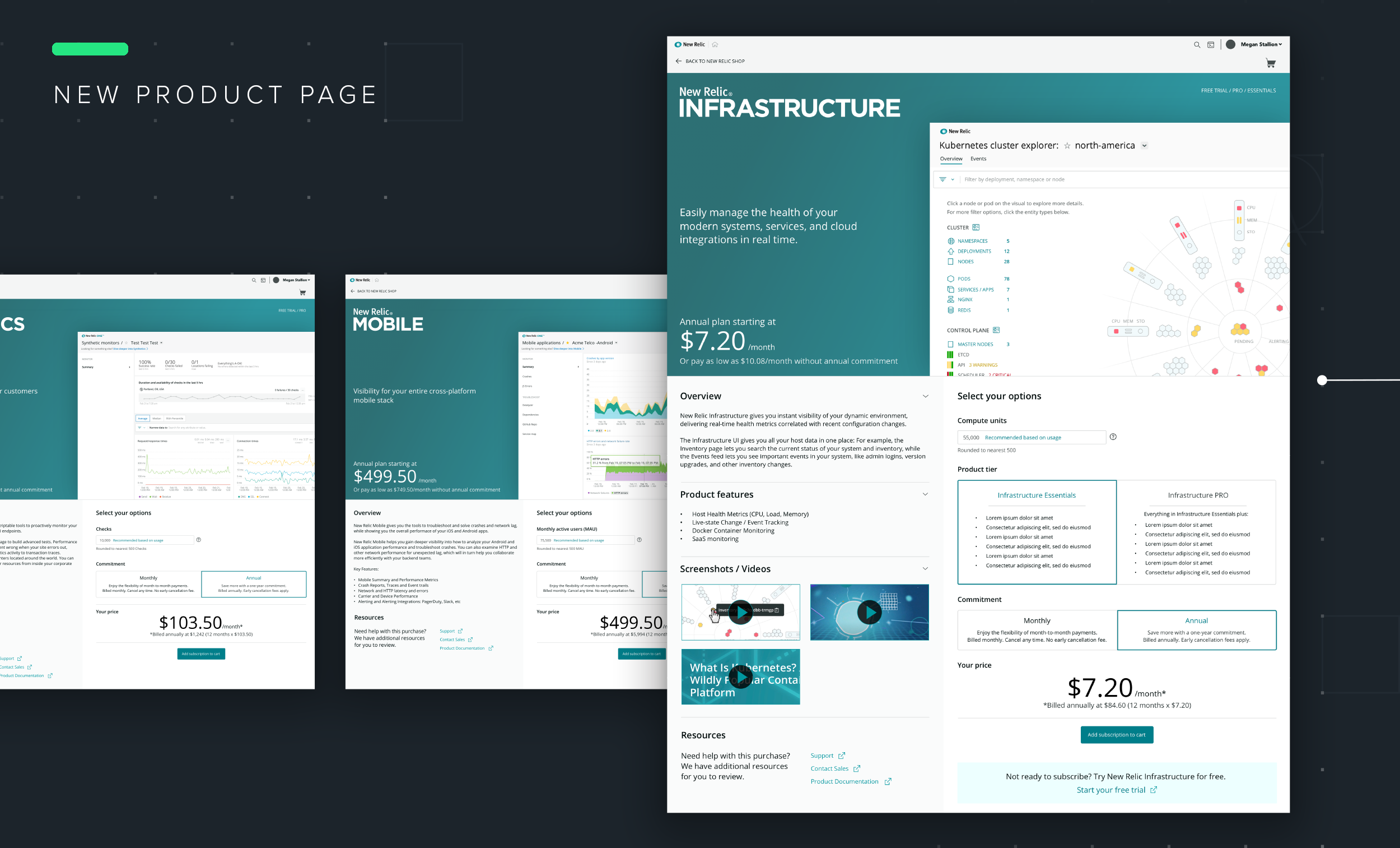
There were four participants — two existing New Relic customers and two new users. Participants were asked to purchase an annual subscription of APM, Pro using the existing e-commerce experience and then to do the same using the new UI. Overall, the participants preferred the new UI to the old one, noting improvements to checkout process and browsing purchases to be most helpful. With these results, we felt confident in moving forward with the new storefront designs.
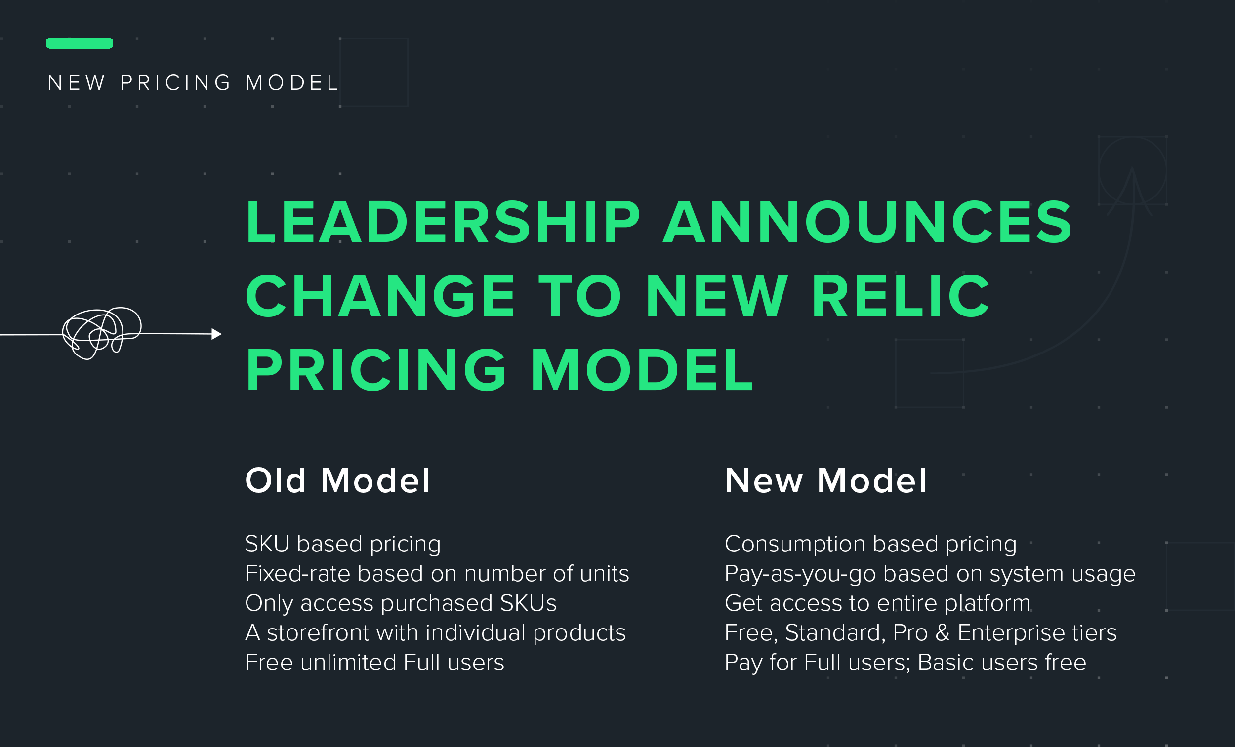
Product Based Pricing Model vs. New Consumption Based Model: Progress is not always a straight line. With new leadership in the product organization came a new pricing model. We were moving away from a product based plan and toward a consumption billing model.
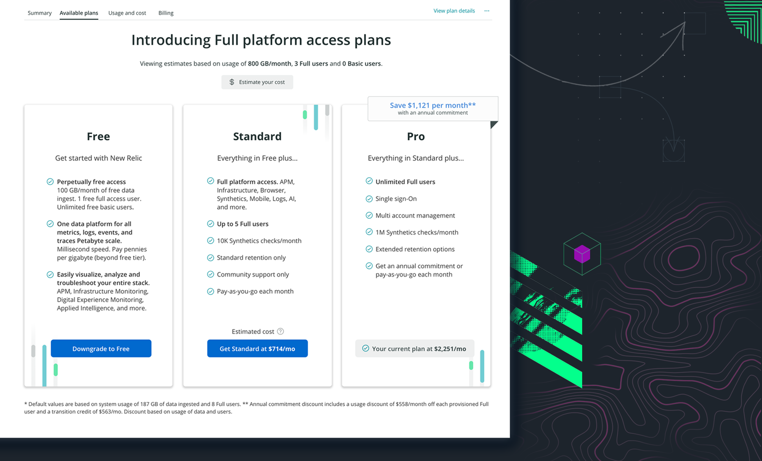
Under the product based plan model customers have a fixed-rate based on quantity of units, SKUs must be purchased individually via an online storefront. In the new consumption based model a customer can “pay as you go” based on their system usage of data and users and when they choose between four tiers (Free, Standard, Pro and Enterprise) can get access to the entire platform.
Even with really promising early results, we would have to scrap most of our proposed designs and shift gears to support users under the new model.
The goal still remained — provide a self-serve experience that helps new and existing customers make informed purchase decisions. In order to do so, we needed to solve for the following…
What plans exist and what are their features, pricing, etc?
What is the anticipated cost under the new plans?
Are there any discounts and volume pricing?
How long will legacy plans and pricing be supported?
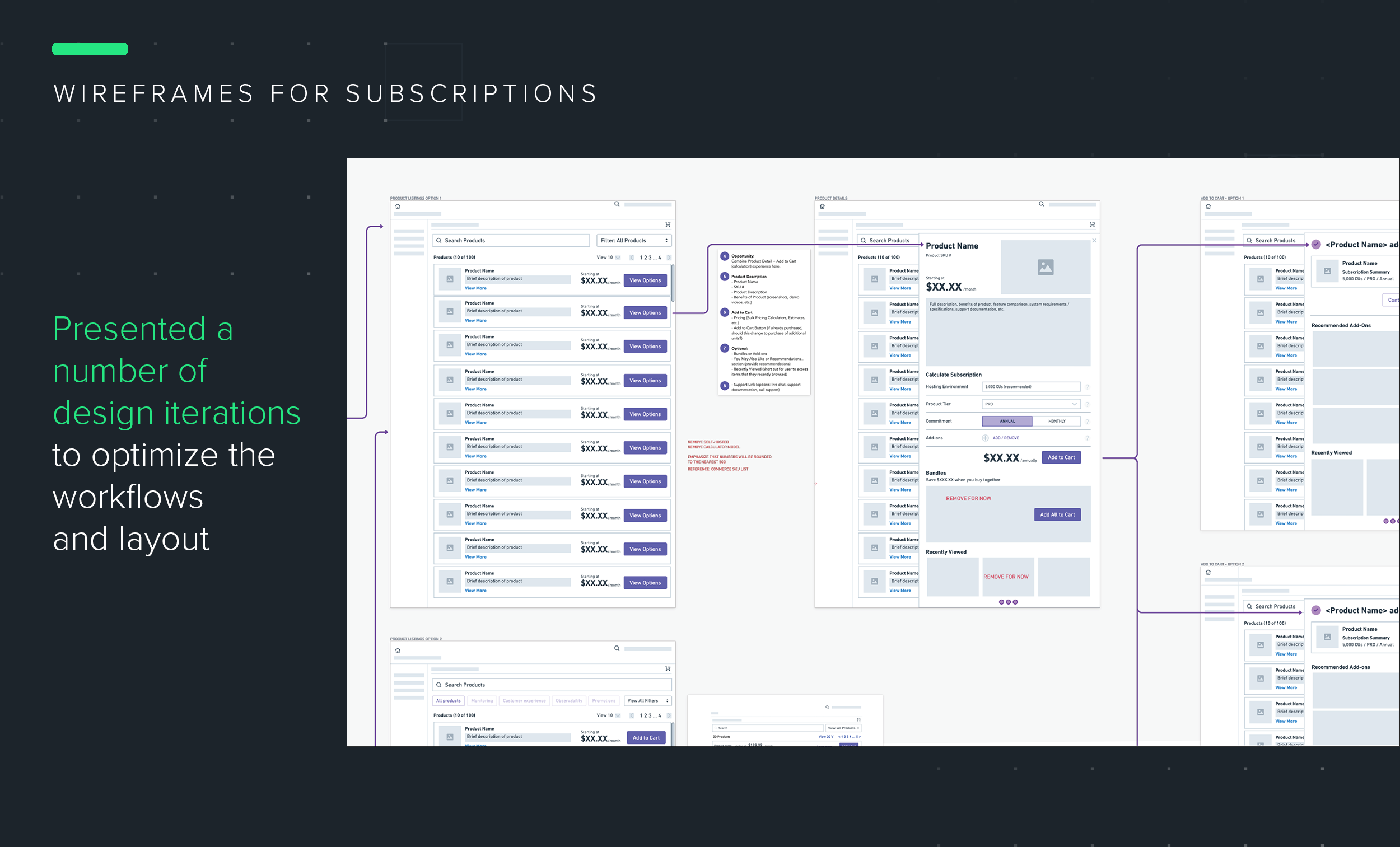
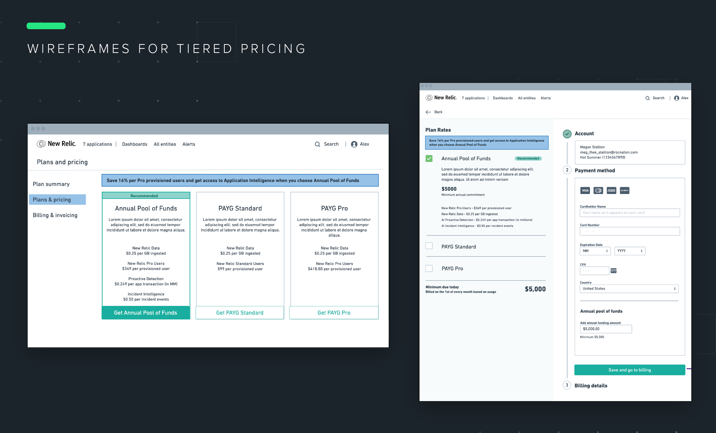
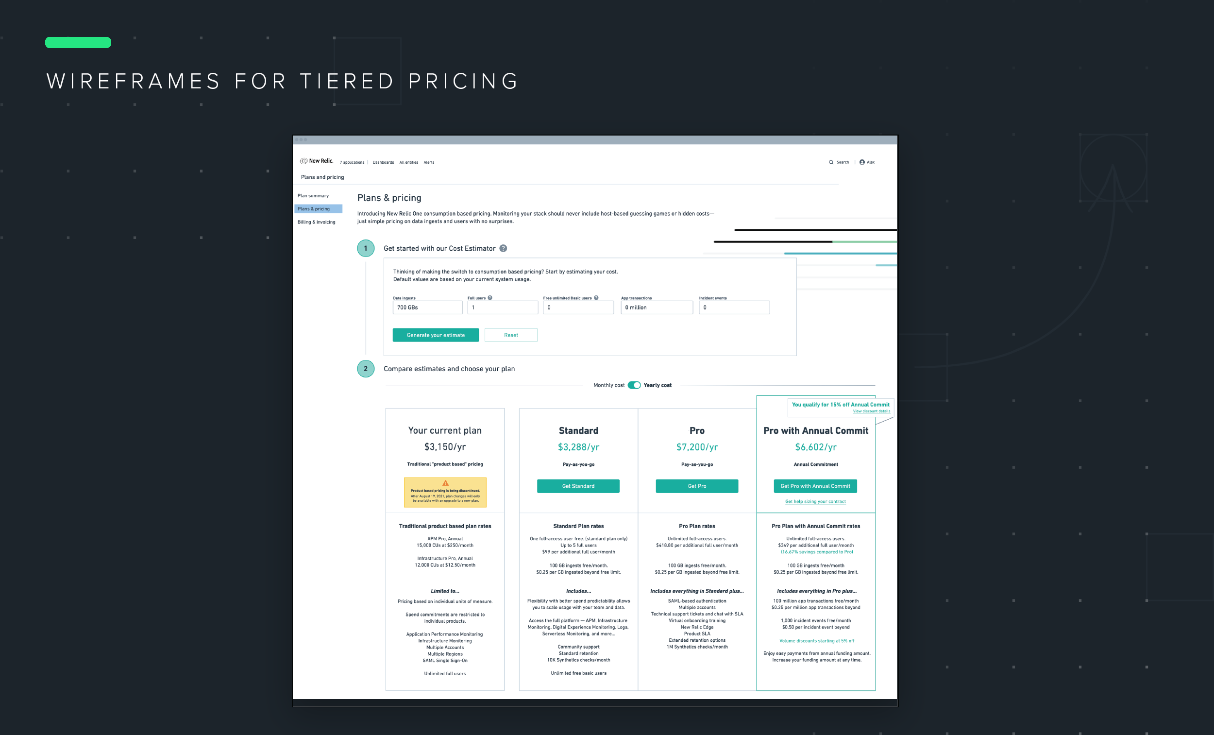
Wireframes: I did a few explorations of a tiered plan pricing page to replace the storefront and product detail pages. We landed on an option that included optimizations to allow for existing customers to migrate to the new model.
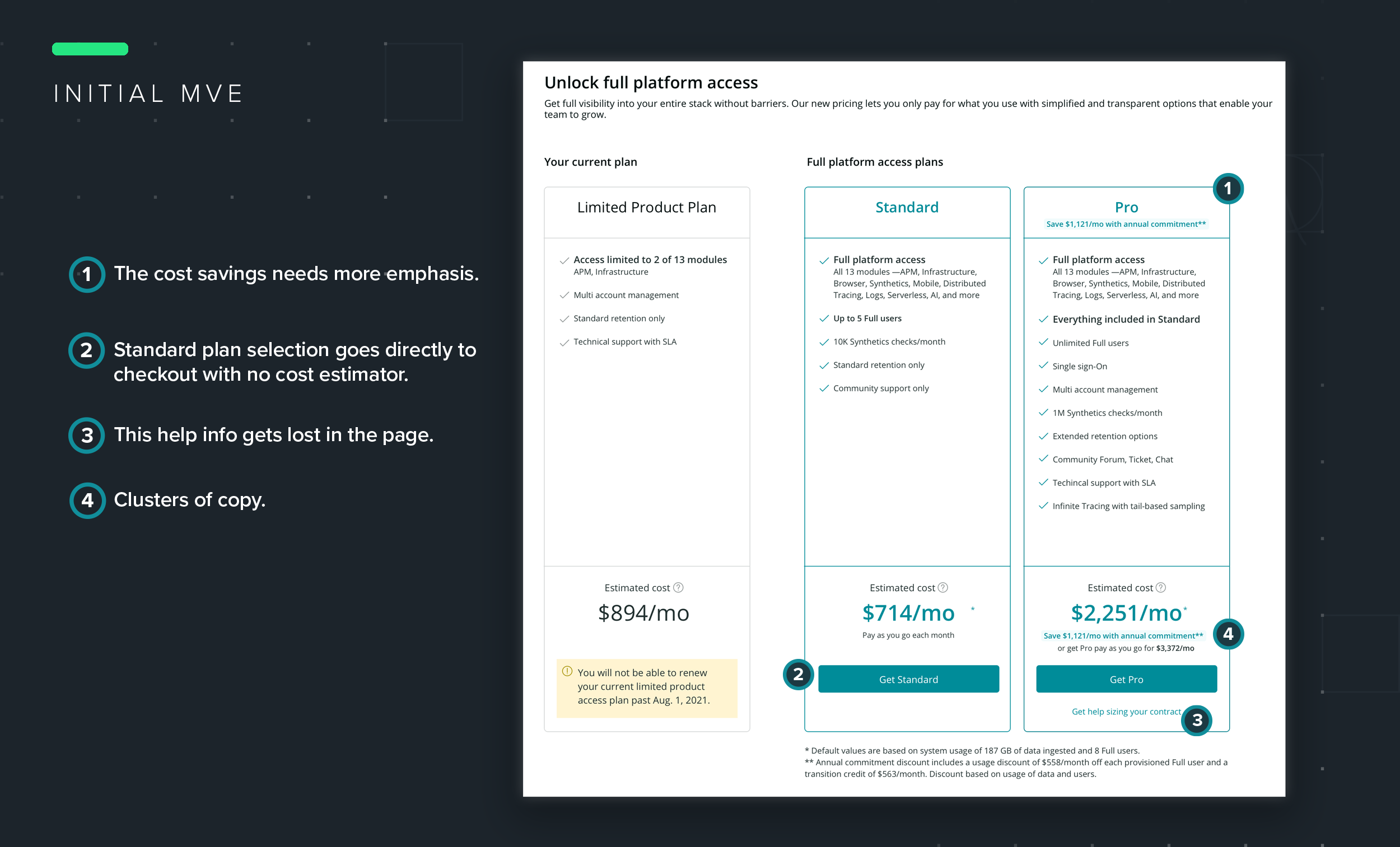
Revisiting the Approach: The solution we released was heavily influenced by senior leaders who prioritized content, wanted to push the Pro plans hard, hide the information related to unlimited Basic users, and strongly enforced the uniformity with the design system.
Content is important but there is a point at which content is a hinderance to the user experience. Copy was redundant, giving the appearance of filling space rather than being truly effective in communicating benefits of a given plan. Unfortunate clusters of information began to form in the need to over-communicate details.
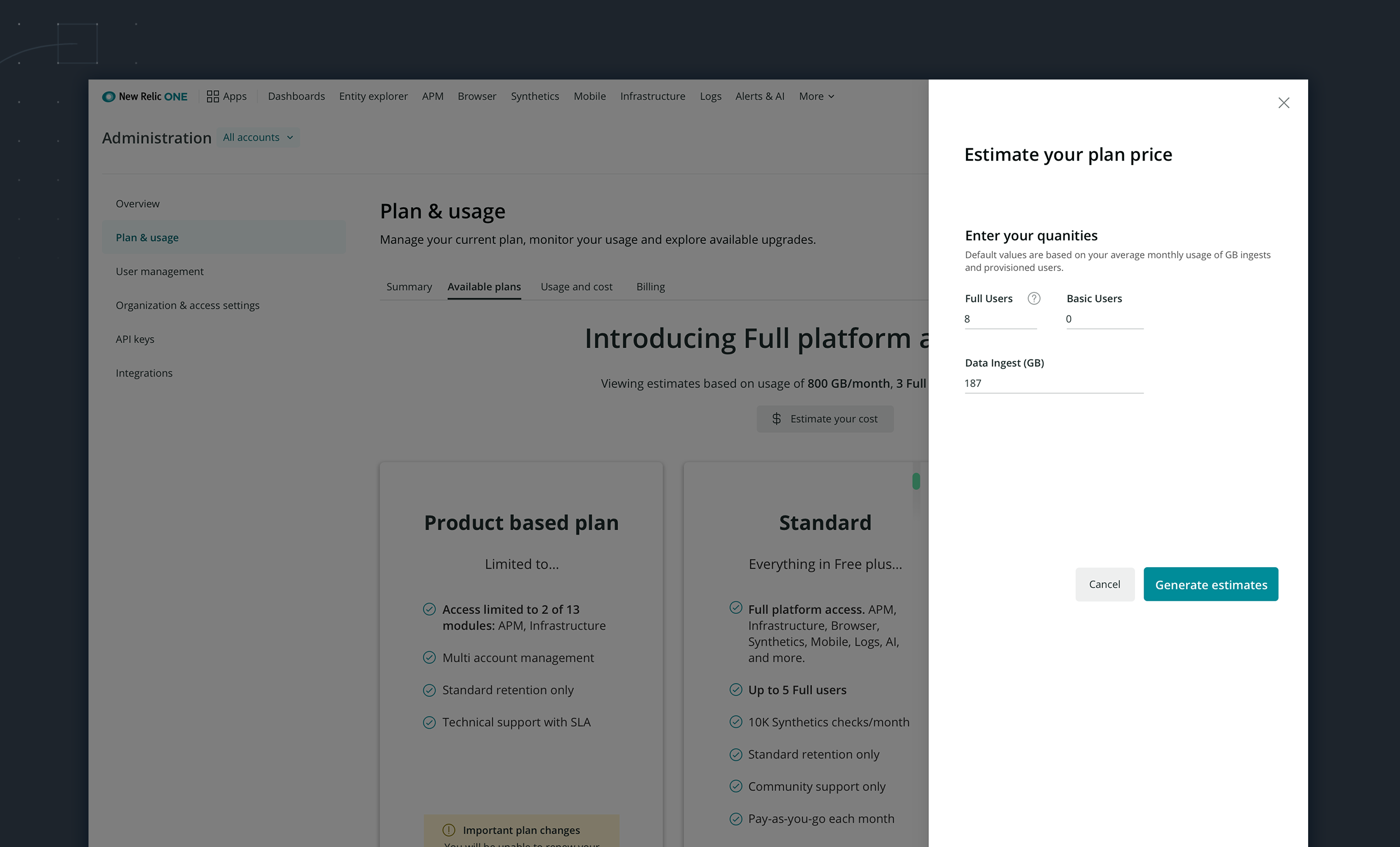
The cost estimator was not a shared experience. Selecting the Standard plan selection would force users into the checkout without having the chance to experiment with the cost estimator. The cost estimator was only available via the Pro plan option. Once in the Pro plan configuration process, selecting options was combined with the cart summary, creating additional complexity.
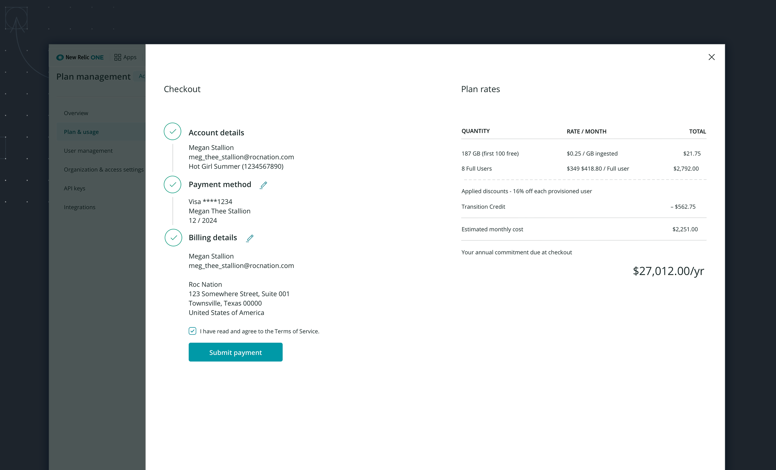
There was a missed opportunity to inform users of free unlimited Basic users that would help to present more attractive plan pricing. While our per GB pricing is low ($.50 per ingest), the real cost driver is the provisioned users. We have two user types—Basic Unlimited users which are free and Full users which are charged at $99 - 418.80 per user/per month depending on your plan. All legacy plans had unlimited Full users at no charge. If they migrate, then they get charged for the full users. From a business perspective, de-emphasizing the Basic user in the layouts would make us more money. However, this could result in higher than expected annual commitments for our under $25K customers. Too sharp of an uptick in cost per user will serve the business well in the short term but in the long-run customers will get angry and leave.
Finally, there was an emotive quality to the designs that was lost between the storefront designs and the new tiered layout. The visual design was flat and uninteresting. This was a result of relying on existing design system components and also on the amount of content shown.
-
I proposed a redesign of this UI that would improve upon the issues of the previous UI. I pulled some of the elements of the New Relic branding into the plans and pricing page to remind the customer of our brand and to add interest. I reduced the redundant copy, using changes in type weight and color to draw emphasis to the new plans. I also introduced a new new violator component to express discounts and incentives.
The cost estimator is no longer buried. It is clearly present at the top of the page. Default values are based on the customers current system usage. The estimator allows users to quickly add their amounts and see it reflect a change in their prices across the board. This allows them to also make decisions about how to provision users between Full and Basic types to get an attractive cost. A confirmation modal that informs the user of a 7-day grace period for reassigning user types.
Lastly, I considered how the plans would scale up and down for customers who are on a free, standard and pro accounts.